 A few years ago, Stampin' Up offered demonstrator planners. They were so nice! SU discontinued them, but the planner itself is reusable. The Franklin Covey inserts fit perfectly; I got mine at Target. Of course, I needed a new cover for it. The cover insert also slides out so it can be replaced. I made one in 2008, but last year I had a Hoops and Yoyo planner (with sound!). Hallmark didn't offer a new H&Y planner this year, so I decided to go back to my old one.
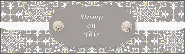
I've finally gotten around to making a 2010 cover for my planner. This year's color combo is Pale Plum, Rich Razzleberry and Basic Gray with splashes of silver EP. The fleur de lis in the corners are embossed with silver EP but overheated to look worn. (It was an accident, but I like the look!)
Supplies (all SU): Stamps: Beware Pirates, Extreme Elements, Vintage Labels; Paper: Pale Plum, Basic Gray, Rich Razzleberry; Ink: VersaMark, Basic Gray, Pale Plum, Rich Razzleberry; Accessories: Basic Gray marker, wide oval punch, corner rounder punch, silver EP, heat gun
Happy stamping!


2 comments:
fun planner with all the pirate stuff
Love the design. Looks very beautiful. Thanks for sharing!!!
Regards,
tri-fold brochure designing
Post a Comment